Orange Isn’t Scary: A Color Guide for Property Managers
Estimated Read Time: 5 Minutes
The Highlights
- Why orange is more than a bold color—it’s a strategic design tool.
- How warm tones like terracotta and copper boost first impressions.
- Where and how to use orange without overwhelming tenants.
- Color psychology insights: orange as a driver of social interaction and tenant retention.
- Real-world benefits: branding, ROI, and enhanced community feel.
Stop Shying Away from Orange—Here’s Why It Might Be the Upgrade Your Property Needs
As a property manager, you’re juggling tenant expectations, maintenance issues, occupancy goals, and budget constraints. So, when someone suggests orange as a color in your common areas or unit design… it’s natural to hesitate. Orange feels bold. Risky. Possibly even tacky.
But here’s the truth: when used strategically, orange can solve real problems—not create them. It can help you differentiate your property, make shared spaces feel more vibrant, and even contribute to better tenant engagement.
Let’s unpack why orange might be one of the most underutilized design tools in multifamily spaces—and how you can use it without regrets.
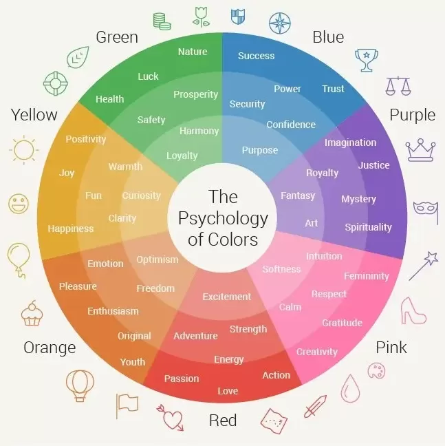
The Psychology of Orange: Warmth, Energy & Connection
Color psychology plays a practical role for property managers. The colors you choose influence how tenants feel about your spaces and can subtly guide how they interact with them.
- Orange = Energy + Warmth
Unlike sterile grays or stark whites, orange injects life into a space. It encourages interaction and social connection—ideal for clubhouses, lounges, and leasing offices.
- Boosting Community
If you’re managing buildings where tenant retention depends on a sense of belonging, orange can nudge people to gather, talk, and stay. Think of it as a passive contributor to community engagement.
- A Tool for Tenant Happiness
A well-painted, warm-toned hallway can make a tenant’s walk home feel less institutional. A pop of burnt orange in the lobby can feel cozy, not clinical. These little emotional touches matter.
Strategic Color = Smart Business
You’re Not Just Choosing Paint—You’re Choosing Perception
We know you’re not decorating for fun. You’re trying to:
- Minimize turnover
- Improve first impressions
- Stay ahead of the property next door
By thoughtfully using orange, you can differentiate your buildings in a crowded market without blowing your budget or alienating tenants.
The Right Shade Makes All the Difference
Let’s be clear: we’re not talking Halloween orange or traffic cone vibes. These are proven, property-friendly tones that get it right:
|
Pro Tip: Use orange as a supporting character—not the lead. It’s most effective when it draws the eye subtly.
Practical Places to Use Orange (Without Regret)
Instead of going full-on orange in large areas, consider these targeted, value-adding locations:
Lobby Accent Walls
Creates a welcoming and memorable first impression.
Leasing Office
Adds personality and approachability to the space where first impressions count most.
Clubhouse Lounges & Game Rooms
Inject energy into your social hubs.
Exterior Details
Use in outdoor furniture or planters to modernize without a full renovation.
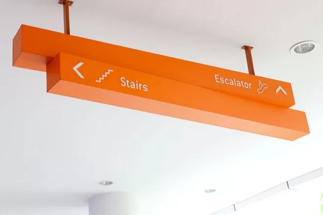
Wayfinding and Signage
Orange is highly visible—great for navigation and branding cohesion.
How IOC Construction Helps You Use Orange the Right Way
You don’t have time to experiment. That’s why IOC Construction offers turnkey solutions that make bold color choices low-risk and high-reward:
- Expert Painting & Finishes
Durable, commercial-grade applications that don’t peel, fade, or look amateur.
- Epoxy Flooring with Personality
Add orange flecks or accents in garage bays, fitness centers, or kids’ areas for a fun-yet-functional look.
- Custom Wall Coverings & Textures
Achieve warmth without full paint jobs using textured materials that include orange tones.
- Wayfinding That Wows
Help tenants navigate with style—orange pops off walls in the right balance of utility and flair.
- Color Consultation Services
We’ll recommend the shades and locations that work for your audience, property class, and existing palette.
| Color Confidence: Tips for Pairing Orange with Other Colors | ||||||||||
|---|---|---|---|---|---|---|---|---|---|---|
|
Knowing the issue helps you determine whether to repair, retrofit, or replace—and helps your contractor scope the work faster.
The Bottom Line for Property Managers Like You
Orange isn’t always a risk. It’s also an opportunity. With the right application, it can:
- Modernize tired spaces
- Increase tenant satisfaction
- Distinguish your property from competitors
- Strengthen your branding across interiors
And most importantly, it does all this without sacrificing professionalism, compliance, or long-term durability.
So don’t fear orange—harness it. Let IOC Construction show you how.
Ready to Use Color More Strategically?
Let’s talk about how a thoughtful splash of orange could upgrade your property—without creating more work or risk for you. Contact IOC Construction for a color consultation tailored to your building type, tenant demographic, and budget.